Behind Outside the Lines’ bold new graphics and animation package

For a while, ESPN Creative Services sounded like the starship Enterprise.
“Our mission was to create a bold new identity for Outside the Lines,” said creative director Michael Ruddy, maybe this mission’s Capt. Kirk.
“A new logo had to capture the spirit of this esteemed investigative series.”
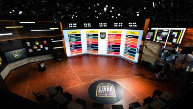
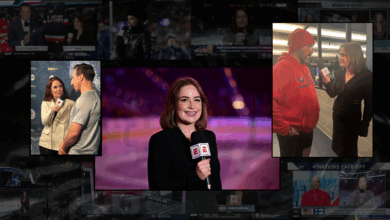
OTL’s new graphics and animation package, designed and developed internally by Ruddy and art director Tim O’Shaughnessy, debuted on Monday’s 3 p.m. ET Outside the Lines.
“We absolutely love it,” said senior coordinating producer David Brofsky, during a rehearsal preparing for the new look. “It’s fresh, clean, and you can read things better on-air. We’re the only show with a look like this.”
Brofsky and supervising director Marti Hanzlik were the production liaisons with Creative Services throughout the process which began last November, and kept everyone in the OTL “family” appraised.
“One of the best things is the big masthead at the bottom, across the BottomLine,” Brofsky says.
“It includes the topic at that specific time, so viewers will know exactly what the show is about.”
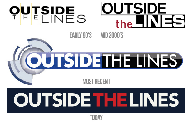
“The centerpiece of the new identity is the OTL logo, it is a striking but unadorned mark that represents the mature attitude of the show,” Ruddy says.
“The result of the animation and graphics is a unique and cohesive identity that captures the essence of the renowned and award-winning program.”


