ESPN’s EURO 2016 designs from Creative Services live up to magnitude of global event
All major global sports events have a distinct look and feel, especially ones that happen only once every four years and travel to a new host country. This is particularly true for the UEFA European Football Championship (EURO 2016), which kicks off on ESPN and ESPN Deportes this Friday (2:30 p.m. ET, France vs Romania).
The month-long tournament (June 10-July 10) will be played in France and will feature 24 of the top 45 national teams in the world. ESPN’s presentation of EURO 2016 will appropriately reflect the host nation – just as ESPN’s 2014 FIFA World Cup coverage represented the look and feel of host country Brazil.
Art Director Tim O’Shaughnessy of ESPN Creative Services discusses the distinctly France-themed creative that his team has prepared for this premier global soccer event.
How long has your team been preparing for this event?
We started the soft planning around Thanksgiving but hit the project with full force right after the College Football National Championship game in January.
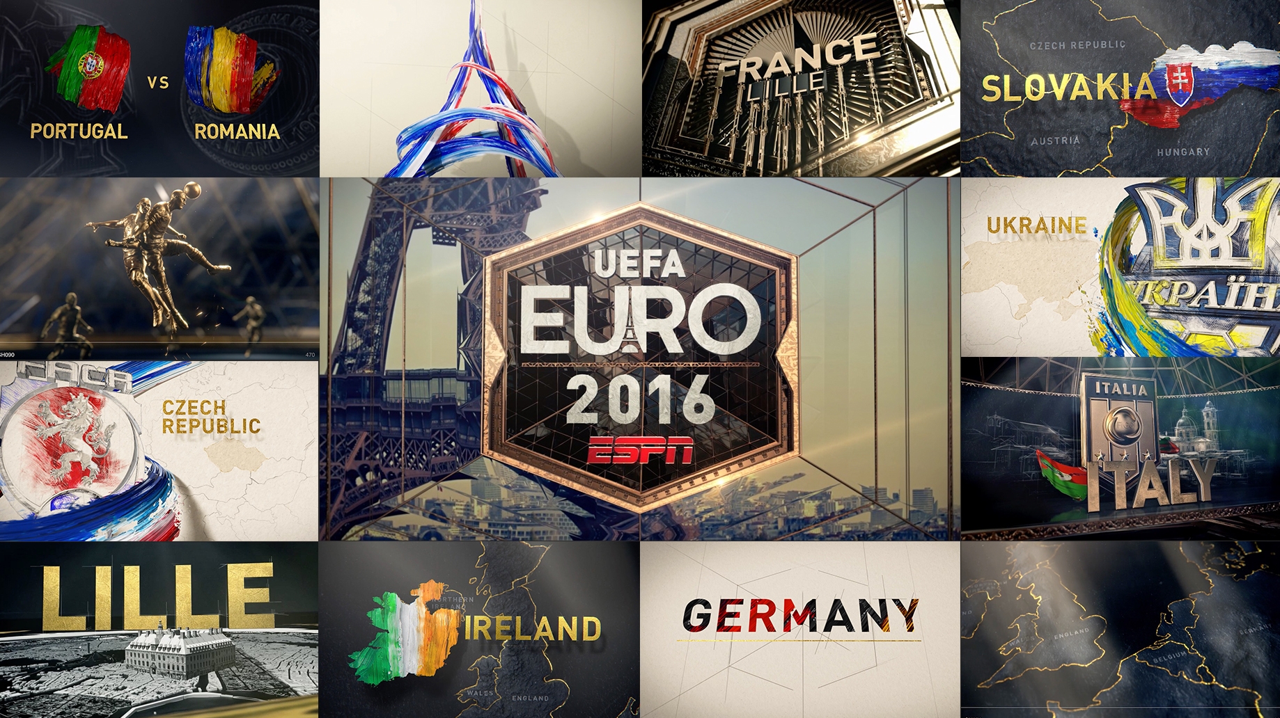
How did you create ESPN’s EURO 2016 logo (seen at right, in center)?
Our logo is a three-part callback to the host nation of France. First, we have the Eiffel Tower in negative space tucked into the logo. Secondly, we constructed the Louvre in 3D and put it on the back of the logo. Lastly, the outlining hexagon of our logo is the shape of the French National squad’s crest. That last part is the subtle Easter egg that only true fans will recognize. We also reinforce the hexagon throughout the package.
What else is your group responsible for?
Our job is to design/concept/create everything that you see on air which isn’t a camera feed of our programming or from the UEFA game feed — essentially to design every on-air graphic, animation, country flag animation, team crest design, matchup animation, map, open and logo system that makes up the skeleton of a show. It’s a tall order.
What were your key goals?
We defined our goal as “to make each frame something the viewer would want to rip off of their TV and hang on their wall.” We chose to leverage location and play off specific design crutches that define the aesthetic of the look. Those being: pencil sketch (old street art), glass and refraction (the Louvre), mechanization (French Industrial Revolution), cartography and dimensional paint.
What was the most challenging aspect?
Redefining our brand and breaking away from our previously established look required new thinking. Designing for countries is a rare luxury and we challenged ourselves to be adventurous. But the real test was to create work we’ve never seen before while still having a place within the sports design landscape.