RIO DE JANEIRO – When ESPN develops an animation package, graphics and other visual elements for a major event telecast, one of the main goals is to celebrate the host country or venue, and make it a prominent thread throughout the broadcast. That’s exactly what ESPN has done for the 2014 FIFA World Cup in Brazil, which continues today with two matches in the Round of 16 on ABC (Brazil vs. Chile, 11:30 a.m. ET and Colombia vs. Uruguay, 3:30 p.m.).
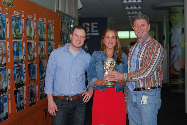
The group charged with designing the look and feel of the production is ESPN Creative Services. Front Row spoke with art director Tim O’Shaughnessy, an eight-year veteran of the company, to discuss the work he and his group put into this massive project.
Discuss the work Creative Services has done for World Cup.
Large global soccer tournaments like this one provide an opportunity to make an animation package that is more textural and environmental than usual. The primary intention is to design a package in which every frame would be something the viewers would want to hang on their walls as a piece of art. That is our primary goal from logo stamps to team identities.
We have five ways to identify a team in this package and celebrate the artwork that each country provides through their own landscapes, flags and beautiful team crests. [Vice President, Creative Services] Rick Paiva, [creative associate producer] Marissa Mangino and myself collaborated with Kyle Cooper, Reno Robertson, Monica Perez and Nadia Tzuo over at Prologue Films when developing this aesthetic. We also had a team of all-star designers and animators here at ESPN in Renata Sedzimir, Nancy Franklin, Tom Roseski, Jorge Gonzalez, Sharrieff Hall, and many more.
How long has Creative Services been working on World Cup?
Roughly 420 days prior to the first kick, we began the design development phase. We needed as much time as possible for our animations. We also designed an entirely new insert look for the tournament. This took a great deal of time to build and thankfully we had two exceptional talents in Stephen Davis and Brian LaPreziosa helping on that end.
Talk about the rhombus in the Brazilian flag, which is a key theme to the World Cup graphics.
We think it is imperative to pay homage to the host country as often as possible in our World Cup designs. We’ve found success here with our team-based Rhombus designs and our alternate logo form that plays off of the rhombus and constellation circle that holds our letter form.
What was the most difficult element to create?
Any element that has massive amounts of running water like our Brazilian team crest animation, or our Foz De Iguacu endstamp, requires a lot of heavy lifting. Our map animations were massive as well, and each required its own matte painting. Additionally, all 32 team crest animations required tons of matte paintings.
How many versions of the World Cup open did you create?
When it comes to the Open, [Senior Vice President and Executive Producer, Production] Jed Drake likes to provide the viewer with variety to differentiate the experience. The final resolve of the Open showcases the trophy embedded within one of many Brazilian environments, varying from Maracana in Rio, to the rain forest, to the favelas. There are five in total.
The middle portion of the Open shows a sweeping animation over the globe, shown from space. During this move, the outlines of the participating countries begin to illuminate, shooting bright light outward. There are three versions of each, thus creating 15 possible combinations for the viewer. In the end, the earth solidifies to the golden globe that sits atop the World Cup trophy.
What are you most proud of regarding your group’s work on this project?
I’m proud of the team’s ability to consistently develop a world-class aesthetic product and always finding ways to improve upon previous efforts. There is always the equation of quality/quantity, and often one sacrifices a bit to account for the other. In this case, I can say proudly that our team delivered a massive amount of quantity (our element reel was over three hours long) and didn’t sacrifice on quality one bit.
– By Bill Hofheimer

• An infROWgraphic explains SportsCenter’s new studio in DC-2 in detail, including the growth of the show’s productions studios, history and more.
• Even in zero gravity, far from Brazil, astronauts were tuned into the World Cup on ESPN.
• Studio anchor Darren Haynes confesses to a superstition, but you’re not getting his entire recipe for great steak.
• ESPN’s Chuck Pagano interviewed Indianapolis Colts head coach Chuck Pagano. Their first-time meeting was unique in more ways than one.

1. Jemele Hill witnesses an act of kindness:
Just saw actress Amy Adams do something incredibly classy. She gave her 1st class seat to an American soldier. I'm an even bigger fan now.
— Jemele Hill (@jemelehill) June 27, 2014
2. From Grantland: How crazy is the NBA draft? Bill Simmons takes a look at what would happen if we redid the top picks from the past 19 years.
3. The new SportsCenter studio is here. For this production assistant, delivering the highlight reel to the new set involved Parkour all over the Bristol campus:
https://www.youtube.com/watch?v=RALqtxqBX5k
4. Enjoy an array of photos from the ESPN Images’ Images of the Week.